Saturday 12 November 2011

Fur Tea Cup

Select a body of work produced in the context of Surrealism and analyse its structure, imagery and meanings, with reference to the context in which it was made and received.

Her delicate, dainty form of perfect feminine proportions crouches upon the pedestal she is displayed upon, as though intimidated by the sensual, overtly sexual guise of sumptuous and exotic Chinese Gazelles fur she has been caressed in. Her very being and everything she stands for has been juxtaposed by the outfit she wears. She is a lowly teacup, spoon and saucer cheaply bought in a department store, but elevated to the status of high art by her adornment in fur. Having leapt straight out of a bizarre dream and landed conveniently in the conscious mind of Meret Oppenheim, whilst she sat in a Parisian cafe in 1936 discussing her fur bracelets with Pablo Picasso and Dora Maar (The Museum of Modern Art, 2004), the teacup she was inspired to wrap with fur by this encounter. Object (Le Déjeuner en Fourrure) so named by Andre Breton, the father of Surrealism, became an icon to the Surrealists. By offering an in depth analysis of the formal qualities of Oppenheim’s iconic cup and saucer this essay will show how Object, through its representation of the ordinary as the extraordinary, cannot be simply understood as a purely aesthetic, modernist piece. Ultimately divorcing Object from either the Surrealist movements or the female artist’s agendas, both of which it was born from, would remove any obvious meaning and message the piece offers.

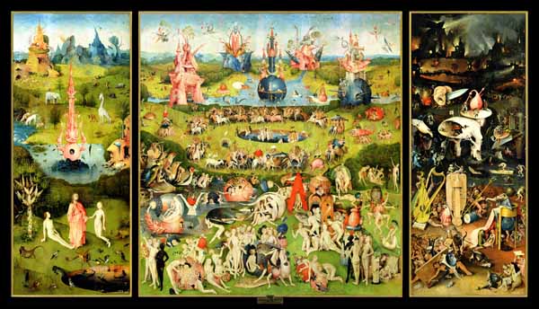
Aesthetics which explore the weird and the fantastic have spanned the history of art, providing the Surrealists’ stylistic heritage.  Hieronymus Bosch’s The Garden of Earthly Delights (c.1500) for example, presents a dream-like landscape of strange people and beasts in what appears to be a fetishist orgy, preceded Surrealism by over 400 years. The movement which is referred to as ‘Surrealism’ however, is an early 20th century avant-garde movement which developed out of Dada under the control of Andre Breton. In The First Manifesto of Surrealism Breton defines the movement as ‘pure psychic automatism by which it is intended to express, either verbally or in writing the real function of thought, in the absence of any control exercised by the reason and outside of all aesthetic and moral preoccupations’ (Breton 1924 cited in Murray & Murray, 1997, p. 511). Essentially it sought to solve the contradictory states of dream and reality by liberating subconscious desires, exploring the psychic and, ultimately ‘capture the true process of thought’ (Murray & Murray, 1997, p. 511). The Surrealist agenda was born from the vogue of Sigmund Freud’s writings, the political turmoil of the interwar period and the Symbolist ideology of escape to a world beyond the material, which had preceded it.

Surrealism swallowed Oppenheim whole. She arrived in Paris at the age of only 18 after being raised in Germany and Switzerland to be befriended by many of the Surrealist artists and go on to be a central character of the movement. It was her acknowledgement of the importance of the object, in particular which brought her status and recognition within the group. The object was favoured as an art form as it exemplified the Surrealist agenda that the dream could become reality. The object functioned symbolically for the hidden sexual desires of the unconscious and, through its apparent mundane function, elevated the ordinary to the status of high art. It acted as a direct critique of bourgeois society and support for Marxism (Sweeny, 1988). Oppenheim’s Object certainly upholds everything the Surrealist object was intended to portray. Its imagery destroys common conceptions of what a teacup should be to become a fanciful, quirky and extraordinary item- it literally looks as though it has fallen straight from a dream.

Oppenheim’s object was very well received by the Surrealists. They recognised the importance of the imagery of Object because of its contribution to the movement’s exploration of dreams becoming reality and it was very well received by the group. Man Ray photographed it in 1936 and ‘used photographic means to heighten the disjuncture’ (Fer, 1993, p. 176) between the ordinary teacup and its extraordinary appearance. He photographs the cup in a standard place setting from the angle it would ordinarily be viewed from if it were being used for its usual function. The way it has been lit however, intensifies the sensation of the fur as it accentuates each individual hair, portraying the pieces oppositional parts.

It is this bizarre, dreamlike imagery of Object which allows it to act as a symbol of the unconscious. The writings of Sigmund Freud which were published in the same period as the Surrealists were operating, undoubtedly influenced the way their art was read. In Object the spoon, cup and saucer, usually found in a smooth, palatable silver or china, have been wrapped in fur, thus altering the meaning of the object and giving it as sexual aspect. According to Freud, fur has the sexual connotation of ‘pubic hair, which should have been followed by the longed-for sight of the female member’ (Freud, Fetishism, p. 354 cited in Fer, 1993, p. 224). The association of pubic hair with the fur in Object, combined with the ordinary association of a teacup with the action of drinking, therefore invites the audience to imagine oral sex; a hugely taboo subject in the 1930’s.  It was possibly for this reason that when exhibited Object caused ‘tension and excitement... expressed in rage laughter, disgust or delight’(Barr, MoMA, 1937 cited in Kelly, 2001, p. 81).

The division of mental life into what is conscious and what is unconscious is the fundamental premise on which psycho-analysis is based” (Freud, 1935, p. 8). To Freud differentiating between the different levels of the mind was essential to uncovering unconscious thought. This idea spoke to the Surrealists. Breton himself described the movement as ‘preoccupied’ by the prospect of psychoanalysis. It seems Oppenheim was also concerned with the unconscious mind and allowed that curiosity to prevail through her work. In Object she confuses the conscious mind’s ideas of what a teacup is with the unconscious mind’s sexual connotations with the fur it is wrapped in. She asked her audience to address her work in a sexual manner, forcing them to bring their animal instinct into their conscious mind whilst in the public arena of the art gallery. Whilst this alone caused embarrassment and upset to those who viewed Object, the feelings were worsened by the fact she had requested their lust be directed to a teacup. She uses the psychological connotations between fur and sex to coerce the audience into an awkward sphere of uncertainty surrounding their own feelings.

The idea that within the Surrealist group ‘woman was made the object of desire, who also stood as a sign for desire’ (1993, p. 176) was regularly explored and something Oppenheim was readily aware of, having posed in 1933 for Man Ray’s photograph Veiled Erotic, Meret Oppenheim at the Press, where she was made the object of this desire. Object can be interpreted as Oppenheim’s quiet subversion of this Surrealist endeavour, if read from a feminist perspective. It would seem that despite Oppenheim’s importance as an artist within the realms of Surrealism, she could not escape the fact she was one of the few women to be involved. Women in Paris in the 1930’s, whilst more liberated than in previous years did not have the right to vote and still suffered prejudice which lasted from the age of prostitution, showgirls and the Moulin Rouge. It is quite obvious then, that Object was intended to question the patriarchal restraints Oppenheim felt from both the society and the company she lived in; the associated unconscious confusion the overall imagery of the object was intended for the male audience.

Oppenheim’s process of wrapping, can also be seen as the process of disguise, further critiquing the sexist French society. Covering the teacup provokes its audience to question what lies underneath; the surface value is ignored and the thing objectified in favour of the inquisitive minds need to explore. This draws parallels with the way men seek to follow their sexual desires and ‘unwrap’ women. Oppenheim demonstrates this parallel further by shrewdly inviting this way of observing her piece as she has wrapped the teacup in a sumptuous, sexual fabric. Whilst the teacup may have been received as ‘erotically charged’ (Barnes, et al., 1999, p. 351)it is still a teacup, a mere object, which almost makes a mockery of the way men gave it the same gaze as they did women. Oppenheim uses the juxtaposition of the sexual and the mundane to attack the masculine society of the time.
Further to this Object, in correct artistic terminology can only be described as a sculpture, which is essentially a masculine entity. Sculptures are traditionally crafted by men in robust, solid and essentially masculine materials, both are rules which Oppenheim and her furry teacup completely destroy.
That art is a reflection of society may be difficult to document, but it is undeniable that the Surrealist movement grew out of the ruins of a world shattered by war’ (Lewis, 1990, p. 1). Whilst the Surrealist movement primarily dealt with liberation of the human mind, the artists were haunted by their experience of the war and so came to deal with political and social revolution. The Surrealists ‘joined the French Communist Party and worked in its organisations from 1927- 1935’ (Lewis, 1990, p. x) and showed an increasing commitment to the party over that period. It may seem strange then that the teacup and fur were, at the time Oppenheim constructed Object, both symbols of the French aristocracy. However, rather than support bourgeois values, Object forcibly rejects them. By combining these two items associated with the wealthy to create an obscure and irrational object, Oppenheim astutely disparages these expensive items. Soon after its construction Object was shown at the highly acclaimed and essentially modern Museum of Modern Art, New York. This took the communist aspect of the piece even further, as a shop bought tea cup, an object of the proletariat, was exhibited alongside high art. This demoted the leisure and lifestyles of the bourgeoisie who would visit the museum, to a level equal to the working class. In the same exhibit Object took the communist ideals of the Surrealist movement into the Museum of Modern Art; it almost suggested that to be modern, one must be communist and therefore firmly supported the Communist Party.

The surreal aesthetic, whilst traceable throughout history, is most notably found outside of Surrealism in Symbolist art. This movement developed almost as a cult in late 19th century Paris. Symbolists were very concerned with escape to a world beyond that of meanings and representations to an ideal, other world. Its members, particularly Guimard’s Metro station entrances’ transformed the appearance of Paris and invited people, quite literally into another world. This would not have gone unnoticed by the Surrealists and certainly seemed to influence their interest in the dream and the other worlds of the unconscious. Particularly in the post war world Surrealists were eager to promote escape: something true of Oppenheim’s Object. It is however, the theories of Sigmund Freud and Oppenheim’s oppression as a woman which set the context for her creation of Object. Through her combination of two unrelated items she creates an oppositional piece which stands up as an icon of Surrealism. Its structure, a teacup wrapped in fur, fulfils the Surrealist agenda to bring the unconscious into the realms of the conscious, whilst attacking the corruption of society, for which they blamed capitalism. Oppenheim also subverts the male dominance of her society by using Freudian theories to dominate the sexual desires of her audience. Overall the political and social context in which Object was made and received ultimately directed its obscure imagery and structure, but it was this very imagery and structure which exemplified Surrealism and readdressed the socio-politics from which it was born.

Bibliography


Ades, D. (1988). Transform The World... Change Life. In T. G. Liverpool, Surrealism: In The Tate Gallery Collection (pp. 6- 10). Liverpool: Tate Gallery Liverpool.
Alexandrian, S. (1970). Surrealist Art. London: Thames and Hudson.
Barnes, R., Coomer, M., Freedman, K., Godfrey, T., Grant, S., Larner, M., et al. (1999). The 20th Century Art Book. London: Phaidon.
Fer, B. (1993). Surrealism, Myth and Psychoanalysis. In B. Fer, D. Batchelor, & P. Wood, Realism, Rationalism, Surrealism: Art Between The Wars (pp. 171- 249). London: Yale University Press.
Freud, S. (1935). The Ego and the Id. (J. Riviere, Trans.) London: The Hogarth Press Ltd.
Kelly, J. (2001). Priere de Foler: The Touch in Surrealism. Dans Mundy, & Jennifer (Éds.), Surrealism; Desire Unbound (pp. 79- 101). London: Tate Publishing Ltd.
Lewis, H. (1990). Dada Turns Red: The Politics of Surrealism. Edinburgh: Edinbugh University Press.
Murray, P., & Murray, L. (1997). Dictionary of Art and Artists. London: Penguin.
Sweeny, M. (1988). A Total Revolution of the Object. In T. t. Liverpool, Surrealism: In The Tate Gallery Collection (pp. 10-13). Liverpool: Tate Gallery Liverpool.
The Museum of Modern Art. (2004). MoMA Highlights. New York: The Museum of Modern Art.


Appendices
1. Oppenheim, Meret. Object (Le Déjeuner en Fourrure. 1936
2. Bosch, Hieronymus. The Garden of Earthly Delights. c.1500
3. Man Ray. Veiled Erotic, Meret Oppenheim at the Press. 1933


Sunday 18 September 2011

Yorkshire Sculpture Park


With summer days somewhat limited in the North of England, I leapt at the opportunity to visit what is essentially the best outdoor sculpture galleries in the country. It is an absolutely unique way to experience modern and contemporary sculpture in 500 acres of stunning Yorkshire dales.

What instantly appealed was the interaction between art and nature that was on offer. Barbara Hepworth and Henry Moore are two of the key benefactors to the park. Their work feels really quite at home nestled into the landscape which shaped their practice (both were educated at Leeds School of Art, where they first met).


One of my favourite pieces was Héros de Lumière by Polish sculptor, Igor Mitoraj. He uses classical ideals and materials in this piece, to produce what looks like a perfect marble replica of the work of Michaelangelo. However, there are some very obvious differences between a classical marble sculpture and this 1986 creation. Whilst classical pieces were made to perfection, Mitoraj has purposefully carved half of a woman's face, questioning classical ideas of perfection. The sheer size of this piece is also overwhelming. Icons and sculptures in antiquity were often larger than life to make them imposing or more valuable as a larger single block of marble would have to be carved. Mitoraj's example is magnified way beyond any classical sculpture would be which gives it a playful, surreal element that once again questions classical ideals and proportions.

I had first seen the work of Jaume Plensa in Nice whilst touring France. Whilst I had not remembered his name, his art work was unmistakeable. Plensa's caters for the public; creating art for the public, to go in public places. He is particularly interested in the interaction of people with the spaces around them and aims to manipulate this relationship with his work. I saw first-hand how alluring his pieces were and how they physically forged people with their surroundings when I tripped over a bollard in an attempt to get this photo of his sculpture in the south of France.
My second encountered of Plensa's work was thankfully injury free and very enjoyable. His huddled figures appear robust, yet insecure and represent the range of human emotion. Placing them in very public arenas forces the audience to interact with them and explore their own feelings. I particularly like the large suspended gongs engraved with emotive text that I was invited to bang. It was quite therapeutic to fill an otherwise empty gallery with the gentle hum of human existence.

As well as a wealth of engaging and though provoking exhibitions, the park, lake and Bretton Hall House are absolutely stunning and provide an experience of art, public art and sculpture that is very thought provoking indeed.

Thursday 11 August 2011

Kandinsky vs Delaunay


A modernist reading of the History of Art would suggest that artists during the early twentieth century were, as a collective, aiming towards producing a pure or abstract art, devoid of any social or political meaning and exiting simply for arts sake. Robert Delaunay (1885- 1941) and Wassily Kandinsky (1866- 1944) represent two artists heralded as canonical in this strive to abstraction and a pure aesthetic by the modernist view. In The Twentieth Century Art Book, Delaunay’s work, especially his use of colour, is described as simply having had a huge ‘impact on the development of abstract art’ (Barnes, et al., 1999). To reduce Delaunay’s complex ideas of colour theory and his reasons for employing them in his work to such, is to inhibit the understanding of his art practice. Similarly, in The Twentieth Century Art Book, the description of Kandinsky’s work is only considered in terms of its aesthetic content, hailing him as ‘one of the founders of pure abstract art’. Robert Delaunay’s The Cardiff Team[1] and Wassily Kandinsky’s Composition VII[2] both painted in the year 1913 will be used to demonstrate that whilst the aesthetic appearance of two art works may be similar and indeed may appear to aim toward the same stylistic consequences of abstraction, the views held by the artists are starkly different.

Whilst the key imagery in Delaunay’s The Cardiff Team is recognisable, the overall style does lean towards abstraction. The motifs are disguised within a grid of coloured blocks, showing Delaunay’s influence from a range of other artistic sources, particularly analytical Cubism(Chipp, 1958). Delaunay was inspired to create this piece ‘from a newspaper photograph of a Cardiff- Paris rugby match’ (National Galleries of Scotland, 2010) as it references popular culture but also the speed of modernity he was influenced to achieve in his paintings by the Futurist movement (Duchting, Robert and Sonia Delaunay; The Triumph of Colour, 1994). Delaunay also references other symbols of the modern world erupting into society in the early twentieth century; an advert for an aircraft construction company, Paris’s famous Ferris wheel, an aeroplane and the Eiffel Tower, which the artist considered to be the ‘archetypal symbol of modernity’ (National Galleries of Scotland, 2010). It could be said then, that the reason for Delaunay’s apparent lean to abstraction is to show the integration of elements of the modern society. By literally fragmenting the recognisable motifs and intercepting them with each other, Delaunay achieves a representation of the integration of people with the new modern world and the excitement which it causes.

It is largely through the artists colour theory however, that his views on this new modernity become fully comprehendible. The movement Orphism was so named by famous French poet Guillaume Apollinaire to describe the work of Delaunay, which he saw as a synthesis of ‘colour, light, music and poetry’ (Duchting, Robert and Sonia Delaunay; The Triumph of Colour, 1994). It was indeed in the relationship between colour and light that Delaunay’s colour theory was based in, as he believed them to have a certain cosmic energy. He was obsessed with the circular haloes of light produced by prisms and went on to compose the non figurative series of Circular Forms, for the brief period from 1912- 1914. In the ‘densely interwoven, complexly modulated colour structures’ (Spate, 1997, p. 92) he painted, Delaunay broke apart the colour spectrum to place contrasting colours adjacent to each other which produced a ‘movement of colours’ (Delaunay, Letter to Wassily Kandinsky, 1912) and a ‘rhythmic simultaneity’ (Delaunay, Light, 1912); essentially Delaunay created movement and dynamic energy in these ‘pure paintings’, through the contrasting colours within them.

Far from being a leap into the realms of pure art however, it would seem that Delaunay, in this period, worked purely on his colour theory, so that it could be applied to his later works to evoke certain meanings. The fact that he returned to imagery at all serves as evidence that Delaunay’s primary aim was not pure art. As he was aware from his involvement in Symbolism the art work could act as a medium of conveying a message to the audience. Importantly, this was best achieved if figuration was used, as ‘the spectator’s conventional expectation is that objects, however disguised, serve as the vehicle of meaning’ (Kuspit, 1975, p. 113); Delaunay wished to return to imagery to promote meaning and give a socio-political message.

In the 1923 version of The Cardiff Team[3] it can be seen how Delaunay employs his dynamic circles of colour and principles of his pure painting to his figurative work. By breaking down the image of the Cardiff rugby team into their dynamic colours, he promotes not only their speed and athleticism, but flattens the image of the human figures, forcing them into the same picture space as the symbols of modernity. Humanism is rejected in this piece in order to promote modernity and modern philosophy, such as ‘Bergson’s intensive, almost poetic, attempt to penetrate the core of non-conceptual consciousness’ (Spate, 1997, p. 87). Delaunay does not only see modernity as an exhilarating age of the machine, but as a magical, almost spiritual force. The use of the term ‘Astra’ is not only an aeroplane construction company , but also means ‘the stars’, which is where, it seems Delaunay wants to take the viewer as their eyes ride the Ferris wheel and fly off in the aeroplane, fully immersing themselves in the twentieth century.

Composition VII ‘must be considered Kandinsky’s masterpiece. Without doubt it is the acme of his artistic achievements’ (Roethel, 1979, p. 104). It was within his composition series, produced between 1910 and 1939 (Dabrowski, 1995, p. 6) that Kandinsky created this unique pictorial experience. Within this series he is hailed by modernist art critics as having moved away from solid figurative representations to a purely optical art based on colour and form alone. As with the work of Delaunay, it must be accepted that the work in question did indeed lean toward abstraction in terms of its aesthetic approach. It must be questioned however, whether Kandinsky used abstraction to achieve a decorative, ‘pure art’ or if it could be said that his work does in fact illustrate his socio-political viewpoint.

Kandinsky’s main aim in his artistic practice was to override the conscious engagement of the viewer in his work. The gesamtkunstwerk; a synthesis of all the arts to create a total art work, was a popular idea introduced by the compositions of Richard Wagner (1830- 1883). Kandinsky was very interested in these ideas as well as the synthesis of colour in which he believed that coulr could be heard, much as music could. Using art to effect the senses was largely inspired in Kandinsky however by the spiritual Theosophist Association practising throughout Europe in the early twentieth century. This movement was concerned with the contention that the arts could directly affect the human soul and allow people to escape the imminent apocalypse, which would be caused by the materialism of modernity. Abstraction was an important step towards aiding the renewal of human souls, to Kandinsky, as it had the potential for ‘communicating his messianic vision of a coming utopian epoch’ (Long, 1975, p. 217). He believed that if the imagery in his work was unrecognisable to the audience, but did exist within his work, then it would be read by the soul. This was seconded by the Theosophists who maintained that ‘truths of the higher worlds were not easily understandable and could best be communicated by indirect and vague means’ (ibid).
The veiled imagery is then, rife in Kandinsky’s work and particularly in Composition VII, which was carefully abstracted and made to conceal imagery in an intricate process of around thirty preparatory pieces. The imagery concerned is mostly biblical, taken from the Book of Revelations, which the Theosophists saw as parallel with the battle of materialism and spirituality in modernity.

Kandinsky believed colour to be a ‘power which directly influences the soul’ (Kandinsky, 1912) and so used a complex colour theory to further promote the philosophical principles of his work. He explains this principle in an elaborate metaphor, which implies that the soul is the piano, played by colour, again affirming the importance of allowing his paintings to be heard as music and entirely affect the audience. Within his complex ideas the light colours of yellows and whites leap from the canvas and approach the viewer, whilst the cold, dark blues and blacks retract into themselves. The spectrum of colours between these two extremes include static, restful green and active, mature red. The use of these colours in Composition VII must be discussed in terms of the veiled imagery in order to fully comprehend the message Kandinsky aimed to feed to the soul of the beholder.

‘If we begin at once to break the bonds which bind us to nature and devote  ourselves purely to a combination of pure colour and abstract form, we shall produce works which are mere decoration’ (Kandinsky, 1912, p. 45). Whilst Kandinsky believed in the idea of a pure art in which colour and form alone conveyed a message, he feared that complete abstraction would lose his art its potential to act as a vehicle for his socio-political ideals. Based on his social and religious beliefs, fuelled by the writings of the Theosophist Association, Kandinsky’s imagery in Composition VII is based on the idea of the Apocalypse, with the key themes of Deluge and the Last Judgement featuring (Long, 1975, p. 217). The image of the boat in the bottom left corner of the picture is a reference to Noah’s Ark, the impending flood and the spiritual reformation of society Kandinsky hopes for. The top right hand corner features an angel with a trumpet[4]; the ‘most characteristic motif of the Last Judgement’ (ibid), the biblical understanding that after death, each person must answer to God. This image persuades the viewers of Kandinsky’s work to rectify their materialistic nature before the Last Judgement. The key images of the ark and the angel can been seen to have been painted in various shades of blue and black to make them seem unobtainable and out of the reach of the observer, against a background of light yellows and oranges which approach them. It is as though Kandinsky is making the irrelevant forms reach out more than the spiritual images, as though denying access to the conscious observer and instead forcing the soul to search for them.

The form of Kandinsky’s Composition VII also stands as evidence that abstraction was not the overarching aim of his career. His early work in Moscow, such as The Singer (1903)[5], shows his interest in peasant communities and the traditional Russian art they practised based around the ancient tradition of the woodblock print, depicting ancient Russian folklore; the Lubok. He had been made aware of the diverse, rural communities outside of Russia’s major cities whilst studying Economics and Law in Moscow, in particular he found Russian Peasant Law ‘fascinating’ (Duchting, Wassily Kandinsky, 1991). Composition VII if carefully considered can be seen to have many of the features of the Lubok such as the dark outlines of images filled with bright colours that don’t quite match the lines. Looking back to folk art for inspiration led Kandinsky to a style that could ‘provide an alternative to Western art of the academic tradition’ (Long, 1975, p. 219)which he wished to move away from to reject the associated materialism.

By moving to abstraction both Delaunay and Kandinsky were idolised by the modernist branch of art history as having paved the way for a ‘pure’ art, devoid of social content. However, Delaunay made an obvious move back to figurative painting after his abstract series in order to apply his theories of dynamic, simultaneous colour to motifs of popular culture and modernity, ultimately leading to his painting The Cardiff Team which shows how he celebrated his modern environment, believing it could lead to ascension to the stars. In the same way, modernist assumed that Kandinsky was working towards a pure form of art, whilst in actual fact he was driven to create pieces that would communicate, through musical colour and concealed biblical imagery, to the soul of his audience, persuading them of the negative effects of modernity. He was calling out for spirituality to destroy materialism through an apocalypse of modernity and return to primitive, religious values. Essentially, both artists used abstracted imagery to express their colour theory which promoted their hugely divergent views on modernity.


Bibliography


Barnes, R., Coomer, M., Freedman, K., Godfrey, T., Grant, S., Larner, M., et al. (1999). The 20th Century Art Book. London: Phaidon.
Butler, A., Van Cleave, C., & Stirling, S. (1997). The Art Book. London: Phaidon.
Chipp, H. B. (1958). Orphism and Colour Theory. The Art Bulletin , 40 (1), 55- 63.
Dabrowski, M. (1995). Kandinsky; Compositions. New York: The Museum of Modern Art.
Delaunay, R. (1912). Letter to Wassily Kandinsky. Retrieved March 13, 2010, from The Artchive: http://www.artchive.com/artchive/D/delaunay.html
Delaunay, R. (1912). Light. Retrieved March 14, 2010, from The Artchive: http://www.artchive.com/artchive/D/delaunay.html
Duchting, H. (1994). Robert and Sonia Delaunay; The Triumph of Colour. Koln: Benedikt Taschen.
Duchting, H. (1991). Wassily Kandinsky. Koln: Benedikt Taschen.
Golding, J. (2000). Kandinsky and the Sound of Colour. In Paths to the Absolute (pp. 81- 113). London: Thames & Hudson.
Kandinsky, W. (1912). Concerning the Spiritual in Art (1977 ed.). (M. T. Sadler, Trans.) New York: Dover.
Kuspit, D. B. (1975). Delaunay's Rationale for Peinture Pure 1909- 15. The Art Journal , 34 (2), 108- 114.
Long, R. C. (1975). Kandinsky's Abstract Style; The Veiling of Apocalyptic Folk Imagery. The Art Journal , 34 (3), 217- 228.
Murray, P., & Murray, L. (1997). Dictionary of Art and Artists (7th Edition ed.). London: Penguin Books.
National Galleries of Scotland. (2010). Robert Delaunay; L'Équipe de Cardiff [The Cardiff Team]. Retrieved March 14, 2010, from National Galleries of Scotland: http://www.nationalgalleries.org/collection/online_az/4:322/result/0/472?initial=D&artistId=3053&artistName=Robert%20Delaunay&submit=1
Roethel, H. K. (1979). Kandinsky. Oxford: Phaidon Press Limited.
Spate, V. (1997). Orphism. In Concepts of Modern Art; From Fauvism to Postmodernism (pp. 85- 96). London: Thames & Hudson.


Images Cited


Image 1- Delaunay, R. (1913) The Cardiff Team. Musée d'Art Moderne de la Ville de Paris, Paris.

Image 2- Kandinsky, W. (1913) Composition VII. The Tretyakov Gallery, Moscow.
  
Image 3- Delaunay, R. (1923) The Cardiff Team. Scottish National Gallery of Modern Art, Edinburgh.

Image 4- Kandinsky, W. (1913) The Last Judgement (a study for Composition VII). Städtische Galerie im Lenbachhaus, Munich. 

 Image 5- Kandinsky, W. (1913) The Singer. Städtische Galerie im Lenbachhaus, Munich. 


[1] See image 1
[2] See image 2
[3] See image 3
[4] The imagery for this was explored by Kandinsky in The Last Judgement (a study for Composition VII) 1913, and been seen clearly in the top right hand corner of the piece (see image 4)
[5] See image 5

Monday 1 August 2011

POP!


Throughout the period in the arts generally defined as ‘modern’ many avant-garde movements radicalised the norms of fine art painting and sculpture, in their attempt to break free of academic tradition and represent social and political issues. None achieve such an innovative and exciting method of doing so as the Pop Art revolution which stormed Britain and America throughout the 1950’s and 60’s. Richard Hamilton, the pioneer of British Pop art, stated that ‘Pop art was what we called mass media, cinema and television; it had nothing to do with fine art’ (Hamilton, 2004). This is essentially what makes the Pop movement modern; it rejected the status quo of the celebrated abstract- expressionist movement, to elevate mundane comic strips and simple imagery to the status of high art. As one of the final movements before the post- modernist art era began, Pop art pulled its inspiration from many of the innovative movements which preceded it. In Synthetic Cubism for example, Braque sampled current newspapers which acted as a social commentary, something which is mirrored in Lichtenstein’s use of popular, comic strip images. In terms of its socio-political outlook The Twentieth Century Art Book describes Pop art as ‘the imagery of consumer society and popular culture’ (Barnes, et al., 1999). This essay will explore the ways in which Pop art addresses the growing consumer culture of the 1960’s, but also attempt to ascertain whether the comment in Life Magazine, 1964, that Pop art (in particular the work of Roy Lichtenstein) is simply ‘tedious copies of the banal’ (Life Magazine, 1964) or if it can be said that the movement addressed more serious socio- political concerns of that period.

‘Bt the early Sixties post-war Americans were happily conditioned to believe anything that mass media put forth, and advertising was embraced without question or hesitation’ (Heller, 2005, p. 5). Huge companies were beginning to hold power over people through the commodification of their goods and creating a consumer culture. Due to the fact that jobs in the urban service and manufacturing industries were rapidly increasing, because of ‘progress on the Interstate Highway System’ and ‘improvements in processing, marketing, and transportation technologies’ (Haren, 1970, p. 431), people were growing richer and moving out of rural occupations into the cities. These people were enticed by the adverts they were subjected to, so sought to be defined by the status of the material things they could now afford. Generally the west was becoming ever more rich, powerful and prosperous, something which allowed Brits and Americans the freedom to consume as they wished in a society where companies had the power to persuade them.
Through this competitive consumer culture, certain styles and fashions became prevalent and accepted as the status quo and became known as popular ‘Pop’ culture. Projection of Pop into the arts is ‘based on the acceptance and use of artefacts, mass advertising and press media’ (Murray & Murray, 1997, p. 413). It is generally accepted that Pop had two separate origins, on in Britain and one in America. ‘The English stream came first, during the 1950’s’ (Murray & Murray, 1997) when Richard Hamilton ‘became one of Pops leading exponents’ (Barnes, et al., 1999)Just What Is It Makes Today’s Home So Different So Appealing? is Hamilton’s 1956 poster which was the premiere of British Pop and is a perfect example of Pop art acting as a commentary of the consumer society. The word ‘home’ used in the title provokes imagery of an intimate, private setting, but Hamilton declines this ideal and instead presents a collage of adverts and magazine cuttings portraying popular culture, lifestyle and celebrities. The impact of this apparent paradox between the traditional and modern concepts of ‘home’ challenges the social issue of consumer culture head on and acts as a critique of the invasion of the mass media into every aspect of life.

Another way in which the earlier Pop art pieces acted as a social critique can be seen by looking at American Pop art, which began later that the British strand, in the early 1960’s. Roy Lichtenstein is a celebrated figure within the field, hailed for his use of the Ben Day dot system in his fine art. This method, widely associated with comic strips and cartoons, baffled art critics and the public alike when it was displayed alongside the fine arts and literally took relevant media and Pop culture into the realms of high art. The premiere example of this comic book art is his Look Mickey of 1961. This piece portrays Mickey Mouse and Donald Duck, fictional Walt Disney characters of comic book fame and is executed only in lurid primary colours. Because Lichtenstein creates it in the celebrated medium of oil on stretched canvas on a huge scale (121.9 x 175.3 cm) usually reserved for academic portraiture, the piece was seen to subvert the idea of art as a bourgeoisie pursuit and present it simply as popular culture; in effect it was addressing the social issue of contested social class, which prevailed throughout the 1960’s in view of the fact that the ongoing Cold War spurred interest into the ideals of communism and equality, leading to a general questioning of class differences (Ehrlich, 1971). If the imagery of Look Mickey is analysed then this idea becomes even more profound and it can be seen how Pop art is not always as simplistic as it first appears. Michael Lobel discusses how psychoanalysis of the joke, where there is a subject (in this case Donald Duck) a joke maker (Mickey Mouse) and a joke receiver (the audience), can reveal that the more ‘animal like’ character of Donald Duck, portrayed on all fours as opposed to Mickey’s standing, personified position, where he is aware of Donald’s self-exposure. According to Lobel these two figures represent ‘a form utterly identified with low culture- that has been made into an easel painting, perhaps the epitome of the high cultural form’ (Lobel, 2002, p. 37), thus supporting the idea that Pop art represents a critique of the social issue of class conflict.

From this starting point Lichtenstein’s work continued to modestly attack society’s status quo. Whilst a consumer culture and increasing affluence were rife in America, its foreign policies were destroying lives, by providing aid to the Southern Government in Vietnam. It was estimated that ‘close to 321,000 Americans have been killed or injured from January, 1961, through April, 1970’ (Ehrlich, 1971, p. 2), which was a huge loss to the nation and a moral drain on society. It is hardly surprising then, that in 1962 Lichtenstein ‘creates his first paintings based on All-American Men of War comics, such as Blam, Takka Takka, and Live Ammo’ (Bellroy, 2007).

Live Ammo is perhaps the most striking of these images, featuring a soldier figure in the larger, left hand panel who simply screams, ‘Take cover!’, whilst the thinner right hand panel features the intimate thoughts of the second figure. The composition of these two figures and their associated text is most interesting when analysing this piece. As a modernist artist, which Lichtenstein undoubtedly is, the most notable aspect of the painting is the cropped picture space, which renders the imagery ambiguous and its context illegible. This same feature however, could be seen to address the very relevant socio- political issue of the Vietnam War. Rather than rendering the image indecipherable, the cropped composition could be seen to enhance the mysticism and interest of the character. When combined with his clearly displayed thoughts this technique juxtaposes the fact that this soldier is both human, with obvious feelings, but also as simply a number whose identity we cannot access; it could be seen as a powerful reference to the American lives wasted through the experience of war. By Lichtenstein’s presentation of such a serious political issue in his signature ‘comic’ style it could also be observed that the images of the two characters actually portray the same person as their features are indistinguishable and very generically presented. In this sense the point of a public and private combatant is enhanced and the purpose of the painting, as a critique of war, is reiterated.

Andy Warhol (1928- 1987) was a radical Pop artist of the 1960’s who subversively reacted to socio- political issues of his time. His contribution to Pop culture, such as his banana album cover for radical group The Velvet Underground which meant his work was literally an object for consumption, but Warhol’s work also attacked some more important social issues. Whilst in cannot be doubted in any reasonable way that in Warhol’s ‘mass producing images of everyday items...he questioned both authorship and the validity of uniqueness’ (Barnes, et al., 1999, p. 484), ultimately remarking upon the consumer culture of the period, it was his Death and Disaster series of the early 1960’s which especially addressed some of the more serious socio- political issues. The most shocking of the images created was 129 Die in Jet (Plane Crash), 1962. This piece literally references a high profile plane crash which killed 129 people. Warhol, it seem was very conscious of the disasters happening around him, commenting,
I guess it was the big plane crash picture, the front page of the newspaper: 129 Die.  I was also painting the Marilyns.  I realized that everything I was doing must have been Death. It was Christmas or Labor Day—a holiday—and every time you turned on the radio they said something like “4 million are going to die.”  (Warhol, 1963).
Skull, 1976, is an example of a much later work in this series. It has been noted that this piece stands for Warhol’s representation of ‘kitsch, commodities and celebrity... in its absence and anonymity, its disaster and death’ (Foster, 2001, p. 79). Warhol was disturbed by the mass media and the way such issues as the death of hundreds of people could be mass produced in the same way marketable goods were in that period. By using a skull as a subject matter, he references the death of every person in the world; it’s a bold critique of loss of individuality, the mass media and mass production.

One of the most notable long term effects of the Second World War was the movement of women from work in the home to aspiring career women. Despite this, the vast majority of adverts for household products in the 1960’s reference women in the traditional ‘housewife’ role and idealise their consumption of associated products. Roy Lichtenstein’s Washing Machine, 1961 and Spray, 1962 are good examples of this as both show a female hand performing the household chores of filling a washing machine and using a spray can. The fact that such a large volume of Lichtenstein’s paintings reference women in this way support the idea that they are a clear critique of the way women were targeted by advertisers as chief consumers. The ‘Romance’ series of his paintings also tackle the gender issues of wider society. Drowning Girl, 1963, for example depicts a female character that would rather drown than ask for help from a male character; it acts as way of showing women’s domination by men in the patriarchal society. It is possible though, that this critique was lost as ‘in several cases the advertising industry borrowed Lichtenstein's comic book style and romance themes to sell consumer goods to female shoppers’ (Whiting, 1992, p. 11); the meaning of the paintings was therefore lost as they were adopted by the sexist consumer culture they sought to resist.

Whilst Pop art is not immediately recognisable as a movement which addresses social and political issues, it can be seen that by critically analysing the content of these radical paintings and prints that they do attack the issues of a growing consumer culture as well as the associated problems such a society created, such as war, polarization of the social classes and sexism. This modernist movement was successful in reflecting the Pop culture of the 1960’s by becoming so available that it too was mass produced, challenging the relationship between high art and mass culture. Overall, Pop art defied fashions and customs of the period to invite criticism of the mass producing, impersonal and essentially consumer culture.


Bibliography


Barnes, R., Coomer, M., Freedman, K., Godfrey, T., Grant, S., Larner, M., et al. (1999). The 20th Century Art Book. London: Phaidon.
Bellroy, C. (2007). Chronology. Retrieved March 04, 2009, from The Roy Lichtenstein Foundation: http://www.lichtensteinfoundation.org/frames.htm
Ehrlich, H. J. (1971). Social Conflict in America: The 1960's. The Sociological Quarterly , 12 (3), 295- 307.
Foster, H. (2001). Death in America. In A. Michelson (Ed.), Andy Warhol (pp. 69-90). London: The MIT Press.
Hamilton, R. (2004). Interview with Richard Hamilton. (J. Tusa, Interviewer)
Hamilton, R. Just What Is It Makes Todays Home So Different, So Appealing? Kunsthalle Tübingen, Tubingen.
Haren, C. C. (1970). Rural Industrial Growth in the 1960's. American Journal of Agricultural Economics , 52 (3), 431- 437.
Heller, S. (2005). The Golden Age of Advertising- The 60's. (J. Heinmann, Ed.) Cologne: Taschen.
Lichtenstein, R. Drowning Girl. Museum Of Modern Art, New York.
Lichtenstein, R. Look Mickey. National Gallery of Washington D.C.
Lichtenstein, R. Spray. Staatsgalerie, Stuttgart.
Lichtenstein, R. Washing Machine. Yale University Art Gallery, New Haven.
Life Magazine. (1964, January 31). Is He The Worst Artist In The U.S? New York: Life Magazine.
Lobel, M. (2002). Image Duplicator. Roy Lichtenstein and the Emergence of Pop Art. New Haven: Yale University Press.
Murray, P., & Murray, L. (1997). Dictionary of Art and Artists. London: Penguin.
Warhol, A. 129 Die In Jet! (Plane Crash). Museum Ludwig College, Cologne.
Warhol, A. (1963). (G. Swenson, Interviewer) Art News.
Warhol, A. Skull. The Dia Art Foundation, New York.
Whiting, C. (1992). Borrowed Spots: The Gendering of Comic Books, Lichtenstein's Paintings, and Dishwasher Detergent. American Art , 9- 35.


Appendices.
1. Hamilton, R. Just What Is It Makes Todays Home So Different, So Appealing? Kunsthalle Tübingen, Tubingen.

  
2. Lichtenstein, R. Drowning Girl. Museum Of Modern Art, New York.

3. Lichtenstein, R. Look Mickey. National Gallery of Washington D.C.


4. Lichtenstein, R. Spray. Staatsgalerie, Stuttgart.

5. Lichtenstein, R. Washing Machine. Yale University Art Gallery, New Haven.


6. Warhol, A. 129 Die In Jet! (Plane Crash). Museum Ludwig College, Cologne.

7. Warhol, A. Skull. The Dia Art Foundation, New York.