

Monday, 30 April 2012
Circusfair Time
I'm pleased that the circus/fair is here again and hope it's sunny for the bank hol weekend!
Friday, 27 April 2012
Helmshore experience 3D

http://360.io/fx6qjF
THIS APP IS AWESOME- click the link for the full 3D experience. It's called panorama 360 and allows you to create gems like this one. Little bubbles of your very favourite places.
Thursday, 26 April 2012
Archives
Sometimes the most exciting bits of museums are the bits you (sadly!) don't get to explore. I have been routing through the archives t the Lady Lever Gallery on the Wirral to find out all the juicy gossip on the painting in the gallery. How much they cost to buy, who they used to belong to and how long it would take someone to restore a painting to its former glory. The archives are a truly fascinating resource to explore. Jealous? No need! Just because you can't pop in and read the material on a normal museum visit, does t mean you can't access this info. Public collections have public access. All you need to do is contact the museums curator or archivist about a painting or art object you are interested in an they will help you uncover it's secrets!


Tuesday, 24 April 2012

Monday, 23 April 2012

Sunday, 22 April 2012
On Close Inspection
A fabulous exhibition of artworks which draw on the industrial processes of Helmshore's past as inspiration. Local art group Flax have created woven, sewn and printed textile pieces, covering themes from raising the nap to the running waterwheel. Well worth a visit, on until 24th June


Saturday, 21 April 2012
Not the worst place you could be sent to work an extra shift
Today I was lent out from Helmshore to help out at another Museum. Originally I had said no. "It's at Gawthorpe?" said Louise, my boss, and so I was sold. I love Gawthorpe. The land in this corner of Padiham, in Lancashire, has need owned by the Shuttleworth family since the 14th century. In the 1600s Gawthorpe meaning 'place of the cuckoo' was built as a home for the family. It remained empty for a long time when, in the 1850s, famous architect Sir Charles Barry, was hired to renovate the hall. It's most recent owner, Miss Rachel Kay-Shuttleworth, decked it out in all the finest arts and crafts furniture and fabric she could. Hence it is full to the brim with Crane and Pugin designs and a hoard of National Portrait Gallery paintings to boot. It didn't really feel like a day a work, all that tea and chats with Gary and Mary!

Friday, 20 April 2012


Thursday, 19 April 2012
National Gallery
I went here today. But I forgot to take a picture so this is one from Christmas! Sadly it was so rainy that this is basically what it looked like. The new office..?
Wednesday, 18 April 2012
"the omnibus is for use, not for beauty"
Assessing the aesthetic of the advertisement on London Omnibuses in the Victorian streetscape.
Off to London Metropolitan Archives for a day of omnibus fun!
Off to London Metropolitan Archives for a day of omnibus fun!
Where there's tea there's hope
I visited my favourite tea shop today. Earl Grey at Leaf on Bold Street, the best tea in the world!


David Hockney R.A.; A Bigger Picture
Of all the exhibitions I saw recently whilst in London, the retrospective of David Hockney's Landscapes at the Royal Academy was leaps and bounds ahead of the others. Hockney is from Bradford and after a long stretch of his work representing the wealth and leisure of California, where he lived a while, he returned to the Yorkshire countryside. The Yorkshire Hockney depicts is a far cry from the grey-purple rolling hills I see when I visit, yet feel strangely nostalgic. Created between 2004- 2011, Hockney used a range of media to re-visit Yorkshire and it is a powerful, colourful journey that his art takes you on.
What struck me first, and continuously throughout the exhibition, was Hockney's use of colour. Like I said, Yorkshire never looked this bright to me. Hockney is no realist though, his art doesn't tell you what's there, it captures how you feel. The striking colour is a celebration of the countryside, the unspoilt land and the power of nature. The Thixendale Trees show the same scene in four seasons. These enormous images use the motif of the tree through different life stages to show the passing of time and the recurrence of themes- fitting for a retrospect.
As well as celebrating nature, Hockney embraces new media. Famous for his experiments with photography and film earlier in his career, Hockney uses this retrospective to look beyond the acceptability once more and shows a series of images he created on his iPad. It is impossible to think of these images as anything but artistic genius when they are seen, reinstating Hockney as the master of the new.
My Grandma lives in Haworth, nestled in the Yorkshire Moors. I can empathise with Hockney's desire to show off the beautiful countryside from these parts. I did worry though, that showing off Yorkshire as an idyllic symbol of rural life, in fine galleries at the Royal Academy, is potentially quite ignorant of an area of the country which is in dire financial straits. His depiction of Saltaire, a once glorious town at the height of the Industrial Revolution, bears not mark of the horrors of unemployment faced by the redundant workforce of the failed manufacturing industry. Instead, this painting shows Saltaire Mills as a proud site of Industrial heritage.
Proud is a good way to sum up the exhibition in fact. Hockney is clearly proud of his heritage and his country side, and for giving art back to the North, I'm proud of him. I certainly left the gallery feeling extremely smug to have thought 'I know where that is!' on my way around the exhibition.
http://www.royalacademy.org.uk/exhibitions/hockney/
Monday, 16 April 2012
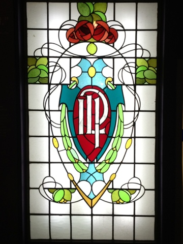
Through the window
A stained glass window from The Clarion, Nelson Independent Labour Party's building. Using art to spread a political message at one of the oldest labour parties in the country. Happy centenary year!
http://www.johnboardman.ismysite.co.uk/index.htm
http://www.johnboardman.ismysite.co.uk/index.htm
Socialism
Walter Crane is best know for his contribution to children's story books. Using a range of imagery borrowed from classical sources and Medieval iconography, Crane changed the way that children learnt to read with his visual approach to learning.
Today I went to the People's History Museum in Manchester and saw quite a different side to Crane's work. This shrine to socialism delivers a history of the development and rise of the labour party from colonialism through Socialism and Communism. Very much on the side of the working class, the museum's approach is to offer an insight into the hard fight for the vote that the new industrial north went through; beginning with the 1819 Peterloo massacre where 18 ordinary workers lost their lives in a peaceful protest turned ugly, and ending with the new labour governments installation in 1945.
Crane was a supporter of Socialism, of people owing the means of production between them. This poster, typical of his work, shows the people overruling the sly serpent capitalism. It seems that Crane, rather like the museum, is very vague about who 'they' are. The poor? The workforce? An underclass? Who is it that only has 'their chains to lose' as Marx put it, under a socialist regime?
For Crane, he believed that artists would prosper under Socialism and had a very idealistic view of the whole thing, shaped it seems by his work and friendship with William Morris. Maybe he thought he could sell more books if his art was liberated from the capitalist monster?!
I also very much liked the caricature poster of Scots coming and taking jobs off English workers. Some things never change...
Sunday, 15 April 2012
Hi Henry
We went to Mitton Hall for Georgie's birthday (happy birthday friend!!) and I thought something nice to share with you all would be this wooden carving on the door of the men's loos! I have it on very good authority that I've been visiting Mitton Hall since I was one week old and testament to this is that I fondly remember Henry VIII guarding the door, from way back when I was too small to reach him. 

Saturday, 14 April 2012
The masters would recommend that the work people wash themselves every morning
Some great rules oft'mill. Shameless plug- we sell these in the shop for £2 if you're keen to stick by them? Some of them seem outrageous, but some make good sense. Why wouldn't you want a clean workforce that didn't 'visit the necessary' unaccompanied on works time? Poor things, working a 13 hour day didn't really leave much for this other than in work I suppose!

Rebel and businessman- George Morland
George Morland learned to paint as an apprentice to his father, Henry Robert Morland. When this apprenticeship ended, George rebelled. Rather like we imagine a stroppy teenager would today, the heady world of art got to Morland and he left home to 'plunge into the exhilarations of young manhood' as a 1954 Arts Council booklet on him delicately puts it.

Rather than following the established route of painting commissions for rich patrons, he painted subjects of his own choosing and sold them through dealers, which was a very modern way of selling art. It meant Morland could please himself and paint as and when he needed the money to support his unlimited extravagance. This was a rash move and separated him from traditional academic painters and the world of patrons and clients. It revolutionised the way art was dealt.
There is no doubt that Morland made a lot of money from the thousands of paintings he produced in his lifetime. One venture of his was to establish deals with London galleries to show his work in an exhibition for which there was an entrance fee and then sell his work on afterwards. In reality though, this did not fully support Morland's laddish way of life or provide him with a regular income and he often faced periods of relative poverty, living for a time in the countryside. His view of a rural way of life in his paintings remained idyllic however, as this genre painting would have sold well with the middle classes living in urban areas.
The Piggery painted in around 1790, at the Lady Lever Art Gallery, is a fine example of one of Morland's picturesque rural paintings. He painted many pictures of pigs, simply because he thought they would be good sellers.

Morland was undoubtedly a very talented painter, who worked incredibly hard over his lifetime; a lifetime cut short by alcoholism. It seems that the tale of too much money and too much talent early in life causing the 'celebrity death' we associate with stars like Amy and Whitney today, isn't perhaps, such a new one.
Friday, 13 April 2012
Oldies
I love finding old photos that you had forgotten you had taken. It's like opening a time capsule and being taken right back to that very moment. It's like Proust with his madeleine cake dipped in tea. Sometimes the moment catches you off guard and you find yourself in a wave of sentiment and nostalgia. A similar feeling is describe by Roland Barthes in his epic Camera Lucida. The punctum, he says, exists in all photographs. It is that which leaps out of time frozen in an image and bruises you, hurts you. It rouses you an stirs something deep inside. Nostalgia is after all, mourning romanticised. Being taken back to that time only reminds us it is time gone, time we don't belong to anymore. As the saying goes though, 'you've got to leave the past behind you' (all moral lessons can be learnt from Lion King).


Poshest chocolate EVER!
This is the wrapper, not the chocolate. That would be posh if the chocolate looked like this
Being fashionable
I borrowed Freddie's cow and turned it into exclusive hair accessory. Thrifty from me!

Thursday, 12 April 2012

Best pub quiz in town
Gareth's quiz, Gareth's quiz! It's the biz, it's Gareth's quiz!
9.30pm (or whenever he gets there) til whenever it ends.
Wednesday evenings at the Victoria Pub (Butcher Brig if you're local), Great Harwood.


9.30pm (or whenever he gets there) til whenever it ends.
Wednesday evenings at the Victoria Pub (Butcher Brig if you're local), Great Harwood.

Frieze 2011; reflections
Translation is generally accepted to be the move of an idea from one form to a novel one in order to open it up to a new audience, in its most traditional sense it means moving the idea from one language to another.
One problem associated with the process of translation is loss. When being translated the original has something of its essence removed, the culture, time, place and relationship with its author is irretrievably lost when it is dismantled, cross examined and ultimately rebuilt in a new form. Translation does have a nostalgic element therefore; we mourn what is lost in the original.
‘No poem is intended for the reader, no picture for the beholder, no symphony for the listener’ (Benjamin, The task of the Translator, 1968 p. 60). What Benjamin argues is that every form which the original might be translated has an essential core, not merely information. It has nothing to say. ‘It tells very little to those that understand it’ (Benjamin, The task of the Translator, 1968, p.60), so what of those who do not understand it? They merely receive a translation of the information. ‘While content and its language form a certain unity in the original, like a fruit and its skin, the language of the translation envelops its content like a royalty robe with ample folds’ (Benjamin, The task of the Translator, 1968 p. 75) language is stuck in the context of time and culture. But translation in itself is an original, which Benjamin describes as the afterlife of the original. Every translation takes place after the original and can never have the same essence. Take the broken vessel. Once broken down and all the parts assessed, no matter how true to the original the new vessel is pieced back together, it will not be the original, but a new vessel. Therefore we can gain from a translation, not just lose out. He ultimately argues that ‘it is the task of the translator to release in his own language that pure language which is under the spell of another’ (Benjamin, The task of the Translator, 1968 p. 80).
In his The Image of Proust, Benjamin notes that what is remembered is infinite. This poses another issue for translation. Different, infinite memories will be taken by the translator in their interpretation of the original, that the original author intended. Likewise, the reader of the translation will reinterpret the text and any notion of the original is lost. Proust himself rejected this notion of loss in translation. Rebecca L. Walkowitz quotes Proust ‘to each sentence we attach a meaning, or at any rate a mental image, which is often a mistranslation’ (Marcel Proust, 1958, p. 194-5). In fact Proust enjoyed the misinterpretations and translations in real life scenarios and used mistaken cultural identity for his own amusement. As Benjamin records he once dropped in on Princess Clermont- Tonnerre and insisted upon staying until his medication was brought. His lengthy description of his house, including the mention of it being the only house on the street with a light still burning, without giving the street name or house number would have been recognised to all in Belle Époque France as the codified description of a brothel. It is ironic that such a description now wouldn’t be recognised and the joke would be lost.
We can find criticism for Benjamin’s theory in contemporary art practice. Rory MacBeth is a graduate from Central St Martins, who is interested in mistranslation and misinterpretation. The last two years of his working life have been devoted to The Wanderer his translation of an iconic Kafka novella from German to English without any previous knowledge of its content or the German language. He doesn’t even use a dictionary. If what Benjamin and Proust theorise is accepted, then it must also be accepted that MacBeth will produce a piece which echoes the original, but becomes its own original; essentially that it will be a good translation. Art journalist Sean Ashton praises Macbeth’s translation for its reliability commenting, ‘just as there is never an absolute semantic fidelity between a conventional translation and an original text, so with Macbeth’s unorthodox translation, there can be no absolute semantic infidelity’ (Sean Ashton, MAP Magazine, 19, Autumn, 2009).
Translation does not stop at language. There are endless considerations when translating art from one form to another. Take the painting by way of example. Mia Johnson argues for a ‘cognitive model for the specific and detailed processes of apprehension, analysis, reflection, and production that occur during the perception of a three-dimensional object or array in the real world and its translation into drawing or painting’ (Johnson, 1993, p. 85). Between the third and second dimension, so much is lost and gained. The new original, the painting, is created and with it a new essence that must be translated. What is lost is that ‘moment’ when painter, subject and painting objects are at work in harmony to produce the painting. Aesthetic translations are also an issue in art historical practice. In her essay on Dutch copies of imported Chinese porcelain in the 15th century, Clare Le Corbeiller insists that we should see Delft ware as a translation of their Asian blue and white counterparts, not as forgeries. They should be recognised as art in their own right. She echoes Benjamin in her defence of Delft ware, commenting ‘For as a rule we are not satisfied with a literal translation from one language to another; we require not a point-by-point correspondence, but an equivalence of intention-of spirit, of effect’ (Le Corbeiller, 1968, p. 270).
Text translated to image occurs frequently in art history writing as images constantly need to be communicated to and conjured in others. Reading Proust is like attending a feast, every sentence is a delicious insight into Proust’s own sight owing to his rich visual language. The form of the text is equally as important as the content for conveying image. Benjamin describes how Proust would have preferred his work to be presented ‘in one volume in two columns and without any paragraphs’ (Benjamin, p. 203) so it would visually emulate his idea that his memories were woven into the tapestry of his writing. This idea can also be found in Lewis Carroll’s Alice’s Adventures in Wonderland. He uses text to play out the child’s innocent confusion between the terms ‘tail’ and ‘tale’ (figure 2). Of course by doing this, it becomes both and the sense of confusion is translated successfully to the audience.

In modern art one piece by Joseph Cornell captures the idea of the form and content of the text translating into an image. Cornell was principally a collector of found objects, but his transformation of everyday items such as pipes, stopwatches, paper, buttons and shells into visual poems of fantasy, memory and dreams. He had a desire to get into the box, to cut himself off from the rest of the world and cocoon himself in a childlike eternity. ‘Unable to get into the box, Cornell could only achieve childhood unsatisfactorily as nostalgia’ (Mavor, 2007, p. 38). In his 1943 piece The Crystal Cage, Cornell stepped away from his three dimensional craft to create a ‘verbal/visual exploration’ for a magazine. The pages reveal images and documents presented in a scrapbook-like manner, which continue Cornell’s interest in collecting. Interwoven in this structure is a short essay which tells the story of Bérénice, a little girl who persuades her parents to take a Chinese Pagoda back to her native New England for her. She moves herself into this Pagoda and constructs a fantasy world with creatures from her study of the skies. The Calligram of the Pagode de Chanteloup (1943) (figure 1) appears within the magazine as Cornell’s realization of Bérénice’s dream world.

Like his boxes, Cornell encases a rambling string of unpunctuated words into the pagoda shape ‘trumpets crowns pet crows... Blue grotto of Capri... Sunday afternoon flowers calliopes Giants Causeway...’ thus creates the image of childhood fantasy from his text.
To appeal to contemporary art once more, text translated to image is an effective tool used by artist Laure Provoust. She Uses text both as the image and to arouse an unconscious image. Her recent installation at London’s Frieze art fair attempted to bruise unconscious insecurities by teasing the individuals rational conscious to look to her work for guidance (figure 3).

Placed around the cattle market of an art fair, which received an estimated sixty thousand visitors last weekend, Provoust’s signs allure to being official guidance as to where to look, where to be cajoled to next, where you are. Instead they are hand-painted with slogans such as ‘Ideally in this room would be a busy African market’ and ‘The fifth floor is wonderful’. What she achieves is a sense of confusion and displacement. Instead of receiving the help you seek, you are slapped with a harsh realisation that you do indeed feel as though you are in an African market. Of course there is no fifth floor, which confuses and wounds the recipient of Provoust’s cruel trick. The harshest perhaps is ‘Ideally here your mother would be waiting for you’- sparking an involuntary, uncomfortable familiarity; the memory of being lost as a child.
Until December 2011 a new film commission will be running at the International Project Space in Birmingham. It is Laure Provoust’s translation of Rory MacBeth’s mistranslation The Wanderer, from written word to film installation, Betty Drunk. If you want to be truly lost in translation, I recommend you go. If he would, I’m sure Proust would do and I’m sure he would enjoy it.

Subscribe to:
Posts (Atom)